the back is going to be tricky. i'm sure there will be progress posts before i clean the post up!


layout/color help needed!!! what sort of colors hsould i go with? should i draw a bg should i use gradient?


*EDIT*
SWEET! i'll be animating at the ASIFA HOLLYWOOD booth 5434 for the anijam on saturday during comic con 4:30-7! haha chris daly eat yer heart out! anijam!!!
http://asifa-hollywood.org/blog/con2007/table.html
--
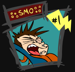
not sure if it's too late but i just emailed asifa hollywood about joining the anijam at comic con. we'll see what happens! i'm working up a "business" card right now, i'll post sketches. i'm trying to figure out if i want it to look:
metal
epic
silly
fun
or
...professional
probably not professional.
it's going to be a trading card. let me know if i should be a "bad guy" or a "good guy" input appreciated! as i said sketches soon!
here's a version in my normal clothes:


7 comments:
be a bad guy who is heavy metal, metal bad guys are always awesome
whaaaaaaaaaaaat?!?!? ANIJAM?? I wanna go!!
dude that is freakin awesome! also, you're going to comic con, which is freakin awesome. I wish i was smo.
hey i'm working on business card designs too! i'd like to see yours! i'll put mine up soon!
nefarious!
I would say you were more of a reluctant anti-hero rather then a good of evil charcter. Then again I was always into character development a little too much.
The posture right now makes you more evil. If you had your hand triumphant up in the air you would look more like a hero.
i think the glow from the top black applied to the bottom black's bg color would look best. it's looking SWEET!
bad guy is definatley the way to go SMo! I did the first on on top.
I like the top one, but you might tone down the brightness of the glow behind your hand a tad. Very cool idea for a business card!
Post a Comment