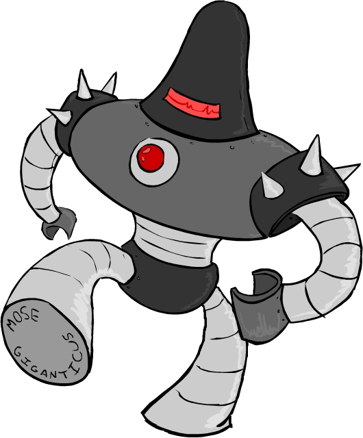
so...i'm drawin some robots for my friend mose giganticus, and this is one of the ideas i came up with.
i've been playing earthbound [well mother 0 for nes] lately and they have a lot of the bulky robots, sort of similar to the 1950's comics designs, and i really liked how it looked, so i went a similar direction. i looked a little at old comics and 1940's stuff, but i mostly found that "metal men" sort of look and there's a lot of wicked boxy stuff too. i tried a lot of things on paper, but i think the big domed head kinda makes it look more menacing. things like no face and one "eye" make it spooky to me too. the more human looking something is the more we associate with it, but if something's humanoid but a little too off, like zombies or faceless robots it's eerie. oh and there's spikes, of course. i'll prolly be doin a few other versions...unless he likes this one right off which'll be pretty rad!
and it is 5 am and i drew this after working on pale force all day so i'm wicked rambly...but the robot's left claw is driving me nuts i'm going to have to fix the perspective on that tomorrow. i just threw it down without thinking. bad animator!


3 comments:
He has an awful jolly bounce to his step for a maniacal machine. I guess that's a way to fool the enemy into thinking he's harmless, and then... oh shit man, my bad I totally fell asleep in the middle of that sentence I can't believe 5 hours has passed since.
...I REALLY LIKE THIS, NICE SHAPES (SHAPETOWN...WOO-HOO) COLORS LOOK REAL FRESH TOO... SMO-RIFIC...
i never played mother 0. But I LOVE EARTHBOUND FOR SNES.
Post a Comment