i'm eternally grateful to ac for giving me my first job in the city. but that's about as far as it goes. the work was work, nothing too stimulating. at least not in the vein of things i'd like to be working with. when i moved to ellen's i was given a pad to take notes. i'd do at least a page of sketches throughout the day while i was waiting for things to load and whatnot. these are some of them. you can tell what my hair/facial hair looked like any given day by my "self portraits." and at the end i was getting frustrated and really wanted to rock out, those are my faves.
also, i have a collection of post-it notes of the flash logo doing something dangerous, that i drew every time the program crashed. i gave up after a while because it crashed so much. i'll try and find those...i like em...
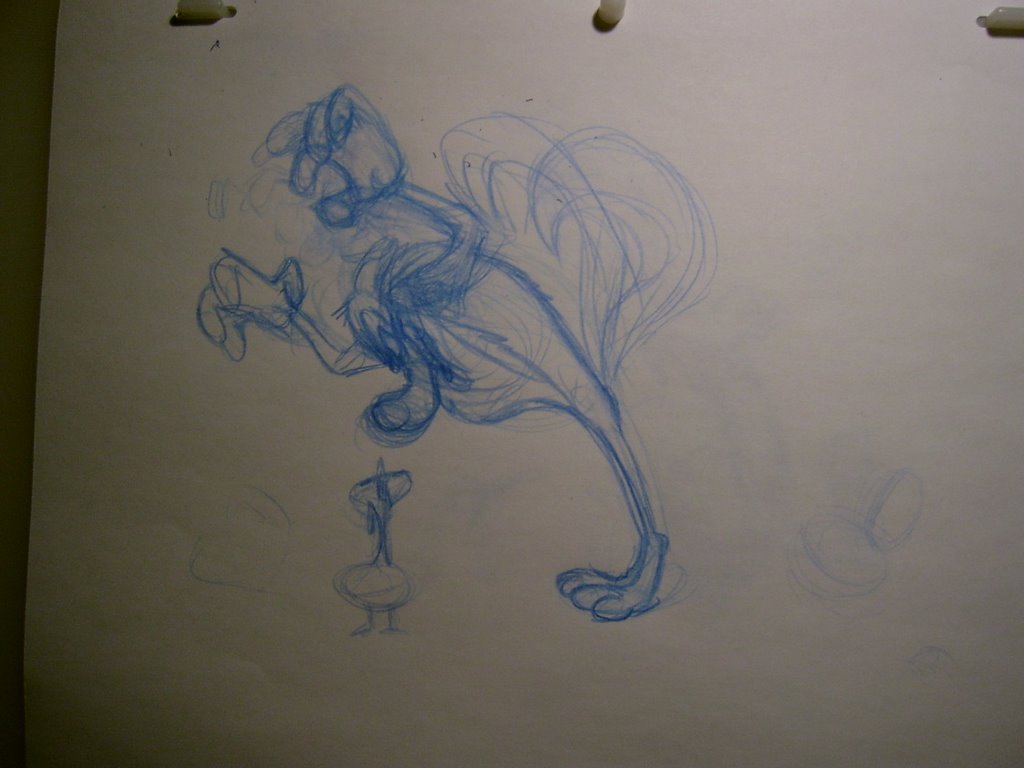
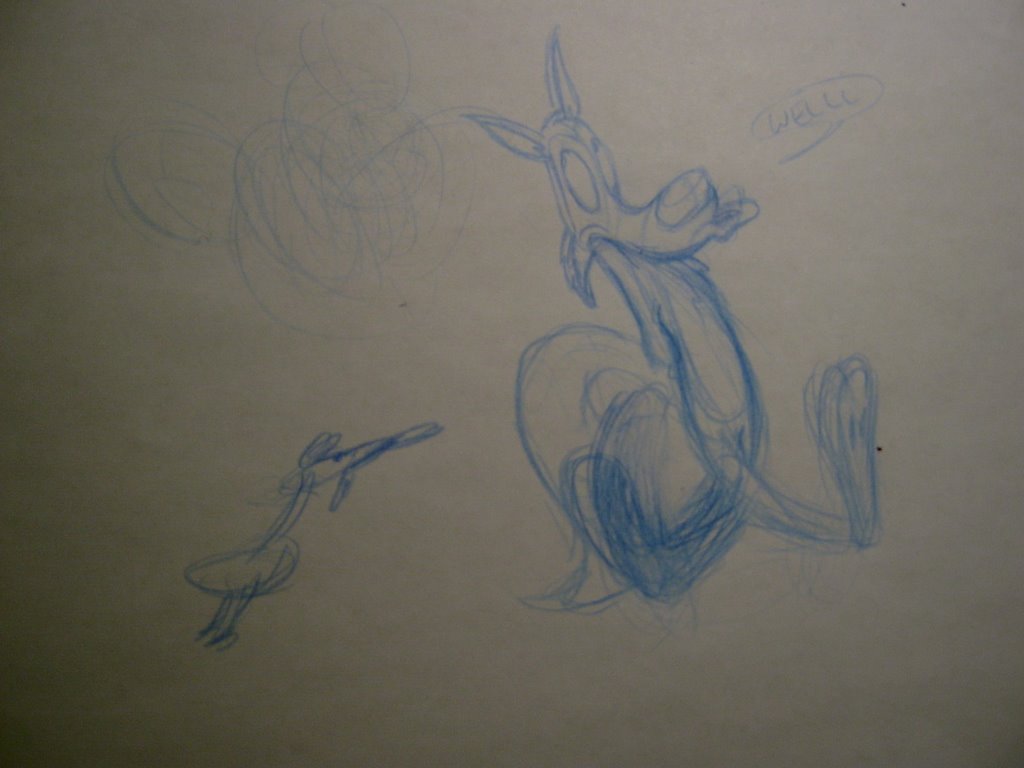
i think i figured out the duck i was messing with before. i might go ahead with the mephiskapheles video because i can apparently get in touch with the band and get the rights. here's a really rough drawing of the duck:
pete and i just were going over some color options, and i thought i'd open it up. thoughts? anything here look good to you? should i have something else?
hey a new option:
here's the first batch before petes suggestions
after a conversation with sean [his blog's to the right] at apples in stereo, i decided to make him more like us, a half breed skapunk, instead of super genre oriented. a "skunk". it's tough because it's busy looking, but so are[/were] we. that way i think it might make it feel less like a genre war sort of thing, and more like this guy's just trying to have fun but the penguin is "too cool."
i'll post the penguin and cleanups soon. just wanted this on file.
i decided not to bog you down, so i uploaded it to that dailymotion thing people seem to be posting lots of classic clips on. now everyone on the internet can find my phone number...dang! i listed it under "extreme"
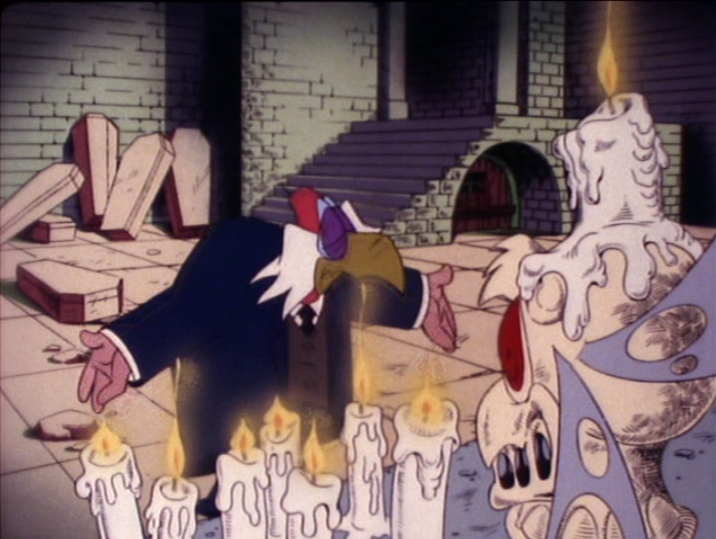
the colliding music in the beginning with Vlad bugs me, but I can't fix anything else on it till wednesday when paleforce is in the can. comments appreciated!
sorry for all the non drawing posts lately, i've been doing more reading than drawing.
united productions of america, was a studio and a reactionary animation movement at the same time. there's so much artwork out there people are calling upa inspired today, but it doesn't move! so without further adieu, here's some upa so you can see what i mean!
Hubley:
this is a john hubley cartoon, whose name has come up a lot recently. hubley was really big on design, and full animation. he has the most designerly of the upa cartoons, rooty toot toot above being his pinnacle, and last short. the characters are very graphic yet they stretch, morph, and change color based on emotion and personality. they express by the way they move and contort. and screen depth becomes very important. Hubley worked to go against his background of Disney cartoons, and worked away from cute design and story.
Cannon:
bobe cannon, was the other primary figure at UPA, he directed gerald mc boing boing above. egos [apparently mostly Hubley's] and sensibilities caused the two to split into two units, with animators and designers jumping between the two. Cannon came from Warners [and did work at disney and mgm for a stint]. An animator for Clampett early on [think porky in wacky land "hello bobo!"] and later Jones. Cannon's directorial style was reactionary as well. Working against stories of violence and over the top gags, which was his background at WB. he directed in a similar fashion to Jones, giving his animators drawings to work from, although they were more actual animation drawings than layouts. his designs also tend to be strong, and he used mis en scen and the backgrounds to direct attention to the characters. he definitely has leanings more in a cute direction, which is definitely less warners. in boing boing [a story by ted giesel...dr. suess!] you can really see cannon's directorial style solidify. more muted action, emotion not delivered by expression or movement, but by setting, graphic but pliable character design. he wanted to make known that the cartoon was made up of drawings that were animated, not just characters that were.
today i think people confuse upa with flat design heavy cartoons. yet neither of these cartoons are still. in the credits of both you'll see very impressive names! art babbit, grim natwick, bill melendez; all sorts of competent animators' names appear in UPA cartoons. they're anything BUT flat and motionless.
designerly cartoons can be beautiful! but take away animation and they quickly lose their appeal. even cannon's more muted cute cartoons move fluidly when they do move, often in ways that most today would consider "off model," by stretching arms without elbows and bending in unusual ways. and hubley's more stylistic designs become even less flat when they move all around the screen and show off their depth. nothing in these cartoons flips from one 3/4 view to another, everything rotates, everything animates.
upa was animation by and for artists who were tired of the norms established in the golden age that, all it's creators came from [therefore they were all rooted in classic animation principle before they experimented]. today we have this trickle down of skewed upa principles mixed with programs like flash to get a highly watered down version of graphic animation, that is flat and lifeless. a lot of that comes from people not having studied actual animation design and principle. some people out there get it though, like my bud dagan moriarty for one; check out his stuff and you'll see life in every drawing, and design principle that the likes of bobe cannon would definitely support! http://daganm.blogspot.com/. upa means design, but it definitely doesn't mean flat! don't let anyone try and convince you otherwise!
again sorry i'm so preachy lately! i'm going to try and start putting some of this theory into practice soon! ...promise!
so i was looking on the scribner project blog today and there were great screens from baby bottleneck of my favorite looney tunes incidental character. i figured i'd give it a shot sketching them and see how i measured up, and damn, i've got a way to go. i think i need to backtrack a bit and just do those blair exercises john k recommends before i get too ahead of myself. talk about humbling!
back in college we had to make a live action psa. i worked with my compadre Bob Rutan, who uploaded this. we came up with the story when ryan, our band's drummer started talking about selling cutco knives and we decided the spoon with a magnet on it might come in handy whilst quelling epileptic seizures...? to my knowledge i boarded this and lit it, bob and i wrote it and bob directed the actors and worked the camera. the dude in the dress is Jon Arliss. known to many as TorF [neither true nor false, here nor there, a being comprised solely of antimatter] the best bass player in central new york, and oddly enough the bassist for bursting mosquitos, the ska band the three of us had in highschool. the "kid" is Matt Gilfus; an exceptional guitarist and an exceptional mega man x player.
Bob uploaded a few of his early college projects [up through sophomore year] to youtube yesterday. go check them out on his blog! he's hilarious and awesome!
I'm reading Michael Barrier's "Hollywood Cartoons," book, and although there's a lot of opinion injected that i disagree with, there a ton of useful tidbits too!
Apparently [according to Barrier via interviews with Clampett] Rod Scribner was pretty influenced by George Lichtenstein, above. Mainly his "Grin and Bear it," comics. He looked to stylistically duplicate the looseness of Lichty's comics in his animation in the 40's. After discussing this with Clampett, he'd get the go ahead to "Lichty it up," and do his really loose animtion. At times he'd use a brush, or ink, etc.
Scribner's a big influence for me so when I find out about where he pulled from I get excited.
i got an apartment in greenpoint where i can have a separate studio room! it's a railroad so it might suck for my roommate...OH WELL!
i celebrated by eating tortellini, accidentally taking a nap while watching pee wee's playhouse, and drawing this picture as mu330 came on when i was working on PF. good day!
this is my new "clean rough" for the little building play by nick jones of Jollyship the Whiz-Bang. I tried inking with a brush again, but i can't deal with anything past inking a character so I'm redoing it in flash. EEK! hooray for free freelance!
this started out as a doodle and it kept going. based only slightly on a friend who gives people free jager when they mention my name at the bar she works at in rochester. swank.
NEWSFLASH! flying disembodied girl head sketch eats wacom!
happy new year all!
this post doesn't really mean anything more than i'm working and back on the computer. but while home i shipped my scanner back to myself, along with pancake batter [in the same box], so if my scanner is in tact and isn't part waffle when it gets here i'll be able to upload a lot of stuff, including animation tests. i have tons of sketches and paper work i'd like to get online.
it's been a pain not having a scanner. it's just a flatbed but when i went crazy during my second animation attempt in college i dremmeled a side down to the glass and installed a pegbar so i could test animation. i'll prolly get a bulk scanner sometime too, and get back in touch with duane paylka and see what's up with scan fix
HOLY CRAP!!! i just dropped a decent coin on amazon to pick up the beany and cecil special edition dvd...but geez...it's friggin awesome! all the excerpts of clampett michael barrier uses on the golden collection dvds come from this beany and cecil dvd. it's insane. people like al pardo, mike carlo, and bob rutan better get in touch with me about checking it out!!!
also for those who haven't seen, check out this interesting article by milt gray [conductor of aforementioned interviews] on clampett and jones:
hey i've been posting a lot! it makes me feel like i'm getting crap done! this morning i thumbnailed the first 2 scenes of my picture [i like sayin picture, it sounds less pretentious than film...and more old timey]. i'll clean up some panels and put em up!
and it's called paper al, i think the egyptians invented it recently? i can't remember. i got a newer tablet but i still feel like i can deal with paper better!
i'd been using this ticonderoga blue pencil you can get at staples for sketching, but when i got to the light table, the lead was way too hard and i couldn't see the drawings underneath [maybe i should buy real animation paper, but i won't be able to fit that in a bulk scanner for testing...] i switched back to col erase and now i'm working with a plain old graphite 2HB because i can draw faster with the softer lead it seems. is that something you guys find useful too? i found these bob camp animation notes on goober sleave's blog [kevin langley] and it looks like he uses a really soft lead in the sketches. it's a lot of the preston blair stuff condensed, with a couple other concepts. here's a link to kevin's post with the notes:
i'm trying to nail character design and some decent poses then i'll start remembering how to animate again and go between the poses. these still may need work, but i'm getting started! i got in touch with an amazing band about helping me with sound and i'm betting i can send them my raymond scott music and they'd play it! CHOICE!
to make a film timed using bar sheets and a metronome, collaborative storyboarding as writing, to utilize exposure sheets, proper breakdown notation, to make something with not a convoluted dialog heavy story, but mostly comprised of things to make people laugh...and to do it on paper...
i thomas sebastian smolenski, on this day of december 1st 2006, solemnly swear to make a gag cartoon within the year.
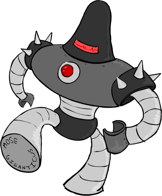
so...i'm drawin some robots for my friend mose giganticus, and this is one of the ideas i came up with.
i've been playing earthbound [well mother 0 for nes] lately and they have a lot of the bulky robots, sort of similar to the 1950's comics designs, and i really liked how it looked, so i went a similar direction. i looked a little at old comics and 1940's stuff, but i mostly found that "metal men" sort of look and there's a lot of wicked boxy stuff too. i tried a lot of things on paper, but i think the big domed head kinda makes it look more menacing. things like no face and one "eye" make it spooky to me too. the more human looking something is the more we associate with it, but if something's humanoid but a little too off, like zombies or faceless robots it's eerie. oh and there's spikes, of course. i'll prolly be doin a few other versions...unless he likes this one right off which'll be pretty rad!
and it is 5 am and i drew this after working on pale force all day so i'm wicked rambly...but the robot's left claw is driving me nuts i'm going to have to fix the perspective on that tomorrow. i just threw it down without thinking. bad animator!
there's more to this drawing...but it's such a bad joke i didn't finish it...i have a lot more stuff on paper these days, but i'm going to try and start pulling a few again to make flashy since i have no scanner!
hey all! sorry for the lack of sketches, i've been busy with pale force! but for anyone who may be slightly curious, i just found dvds of all my college projects...nothing i'm proud of, all things i learned from...but that being said i'm going to be putting them all on a dvd soon, hopefully with some supplemental material of explainations of what was actually SUPPOSED to happen in all of em...since none were ever completed.
and since the soundtracks for all of them [except the most recent...were it done properly it would have been...i bought sheet music from the raymond scott archives] are performed by the bursting mosquitos...i'll be throwing in some of those old tracks as well...since that CD was lost in the studio, it seems only fitting to put it on a collection of incomplete works.
basically this is me getting all this stuff out of my system and wrapping up loose ends, so i can grow up and move on. if you want a copy you're probably crazy. but we'll work something out...since i am too.
if i get any manner of response here, i'll get crackin. otherwise i'll probably drag my feet...and never get it done...since i'm pretty embarassed by everything that will be on it...
pale force is totally made by jim gaffigan, paul and pat noth, brett hall and myself! which basically means minimal sleep for all of us! so i totally appreciate you checking it out! there's some really funny stuff in these! give em a look!
when i stopped thinking like a poindexter and started thinking like an animator i figured this out! it's almost ready, just gotta get the ink squirtin in and adjust the "mouseover" at the top! then i can meddle with the other colored ones and THEN website content! only 3 options this time, so no more reviews like "it's all looks and no content - aaron cripps" haha!
clicking him totally works now!
okay i suppose i AM headed down the all looks and no content road again...but i plan on content i SWEAR!
so i've just wasted an incredible amount of time attempting to learn flash actionscripting...and it didn't even totally work! i did at least get the first 2 button states to work, try scrolling over the squid, he totally changes! wacky!
*edit* just kinda fixed up the clicking, if you "press" the mouse down on him something happens, but if you scroll over him again he reverts back. i'm learnin, just slow!
also! i seem to have disappeared from the blogosphere for the moment!
i got a job working on a segment for conan o brien [and the internets] called pale force starring jim gaffigan...oh and conan...
it was enough work for me to quit ac! but i still have another week and a half left so right now i'm working 2 jobs...and tonight is testiment to the fact that my misguided attention span may give me trouble, since i've apparently been working with actionscripting for the last 4 hours instead of what i'm SUPPOSED to be doing...